MindImmune

Helping a brand take the next step towards solving Alzheimer’s.
MindImmune Therapeutics is developing a new approach to Alzheimer's disease, one that targets the immune system's role in driving neurodegeneration rather than the amyloid and tau proteins that have dominated research for decades. The science is credentialed, the team is deep, and the funding reflects it. Heading into Series B fundraising with $30 million already raised, MindImmune had the profile of a company on the verge of something significant.
With their science rapidly sharpening into a clear picture of a clinical-stage therapeutic, they decided it was time for an evolution of the brand and approached Newfound to rebuild the identity from scratch.
Sebastian Calvo
Creative Director
Billy DeNatale
Creative Director, Design Lead
Aman Sharma
Web Development

The identity recalibrates MindImmune from “lifestyle” to precision science.
From the outset of the project, the creative task centered around reframing the connotations that had become associated with MindImmune. Their own word for it was "lifestyle"—approachable where they needed to be authoritative, soft where the science was sharp. For a therapeutics company at this stage, that misalignment had real consequences.
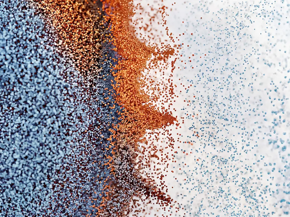
The decision early on was that the identity would be grounded in the science—not as a constraint, but as a creative starting point. The imagery, palette, mark, and the typographic system each take cues from the molecular and cellular world of MindImmune's research, interpreted with enough creative latitude to feel like a considered choice rather than a scientific illustration.


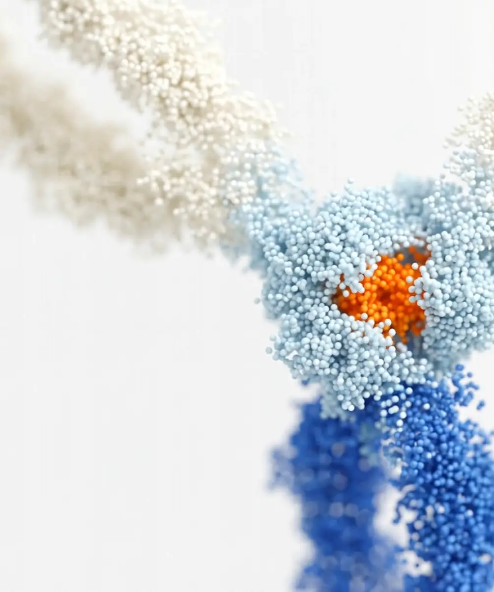
A visual system that echoes the cellular rhythm of MindImmune’s work.
The biological cell is the organizing idea of the mark and of the identity as a whole. It's the unit MindImmune's science focuses on, and the system was built as a reflection of the science. The geometry is spherical and modular, drawn from the biology rather than imposed on it. The MI monogram emerges from that geometry as a result rather than a starting point.

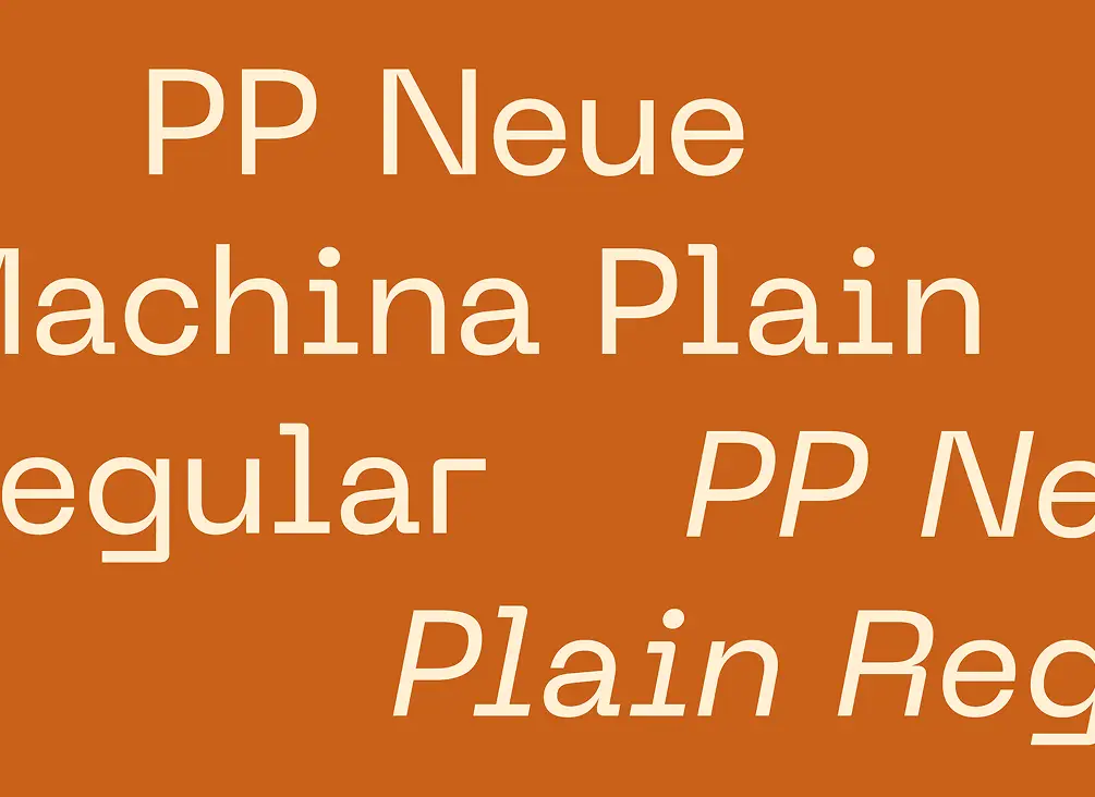
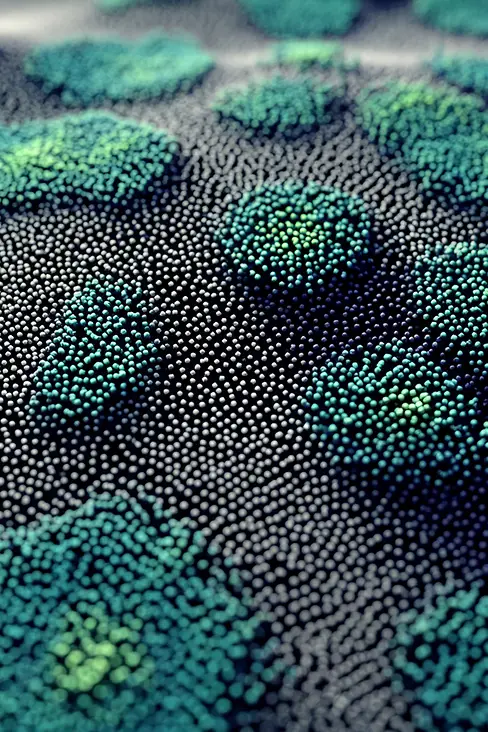
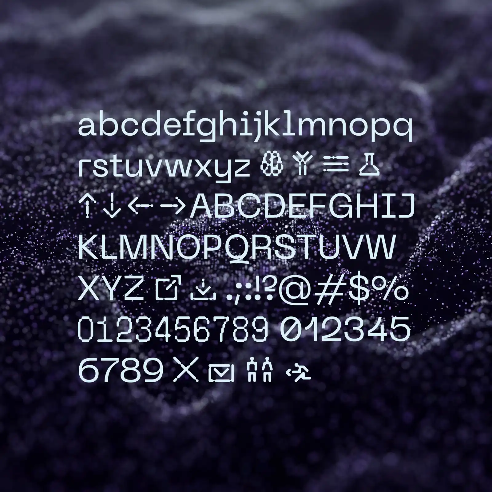


The system absorbs the logic of the science and builds something that feels native to that world without being literal.
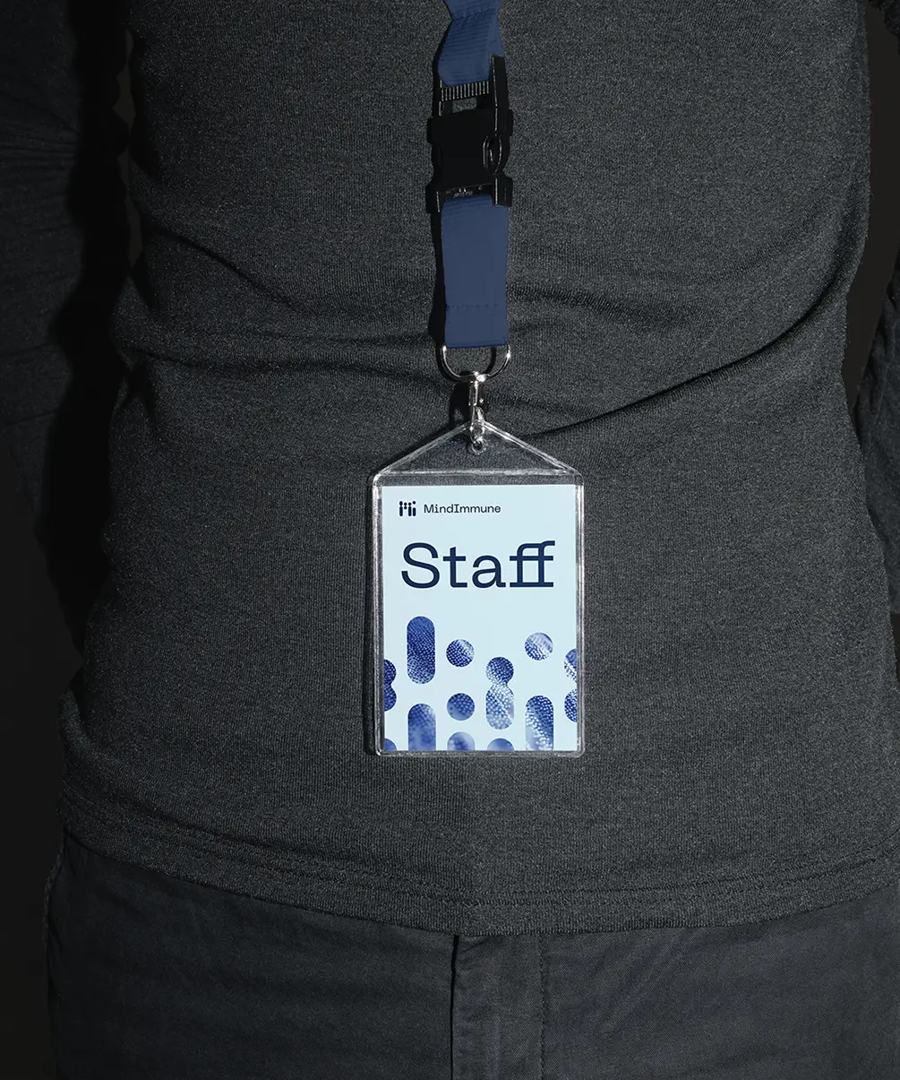
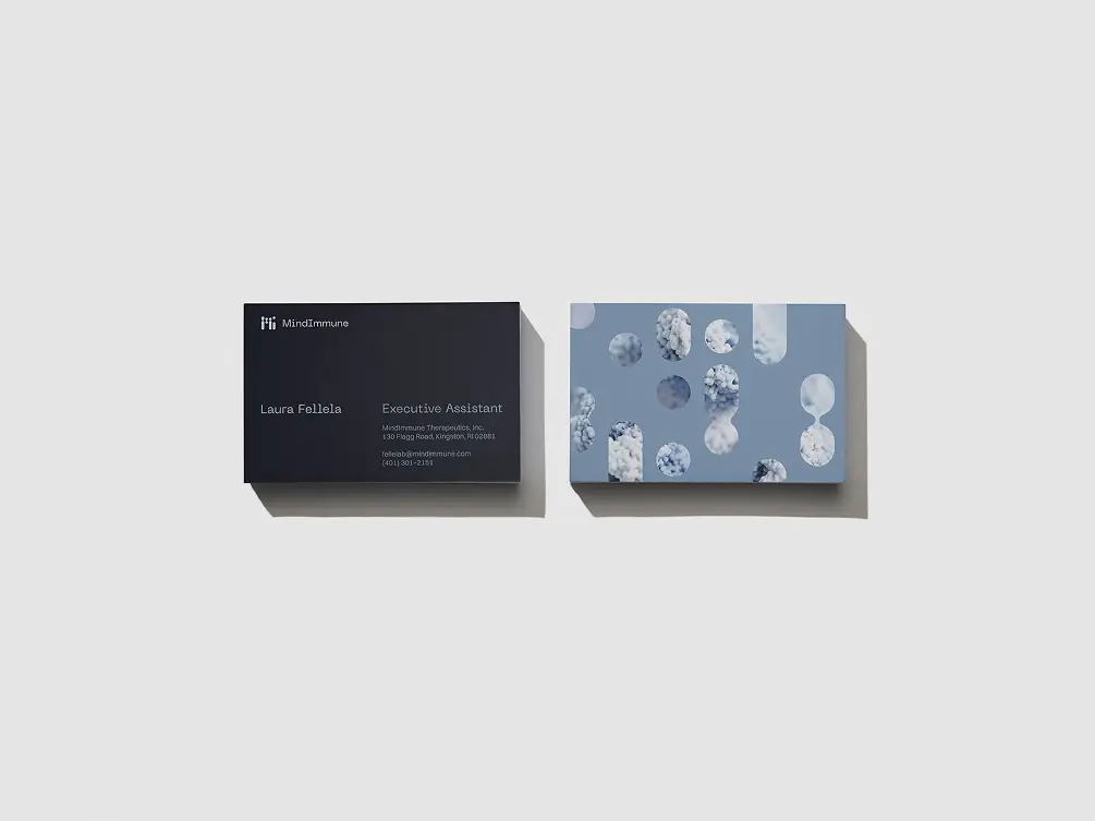
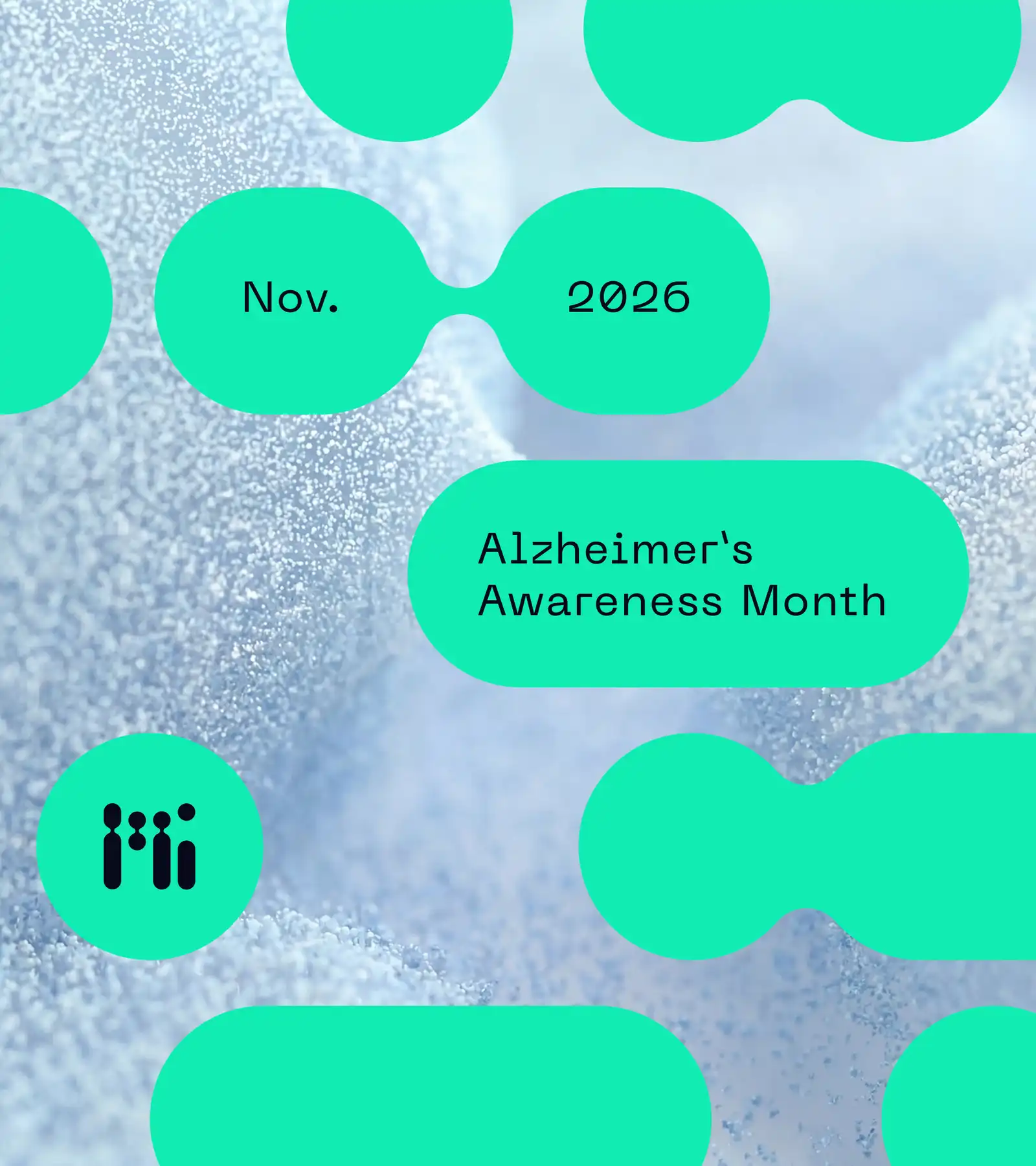
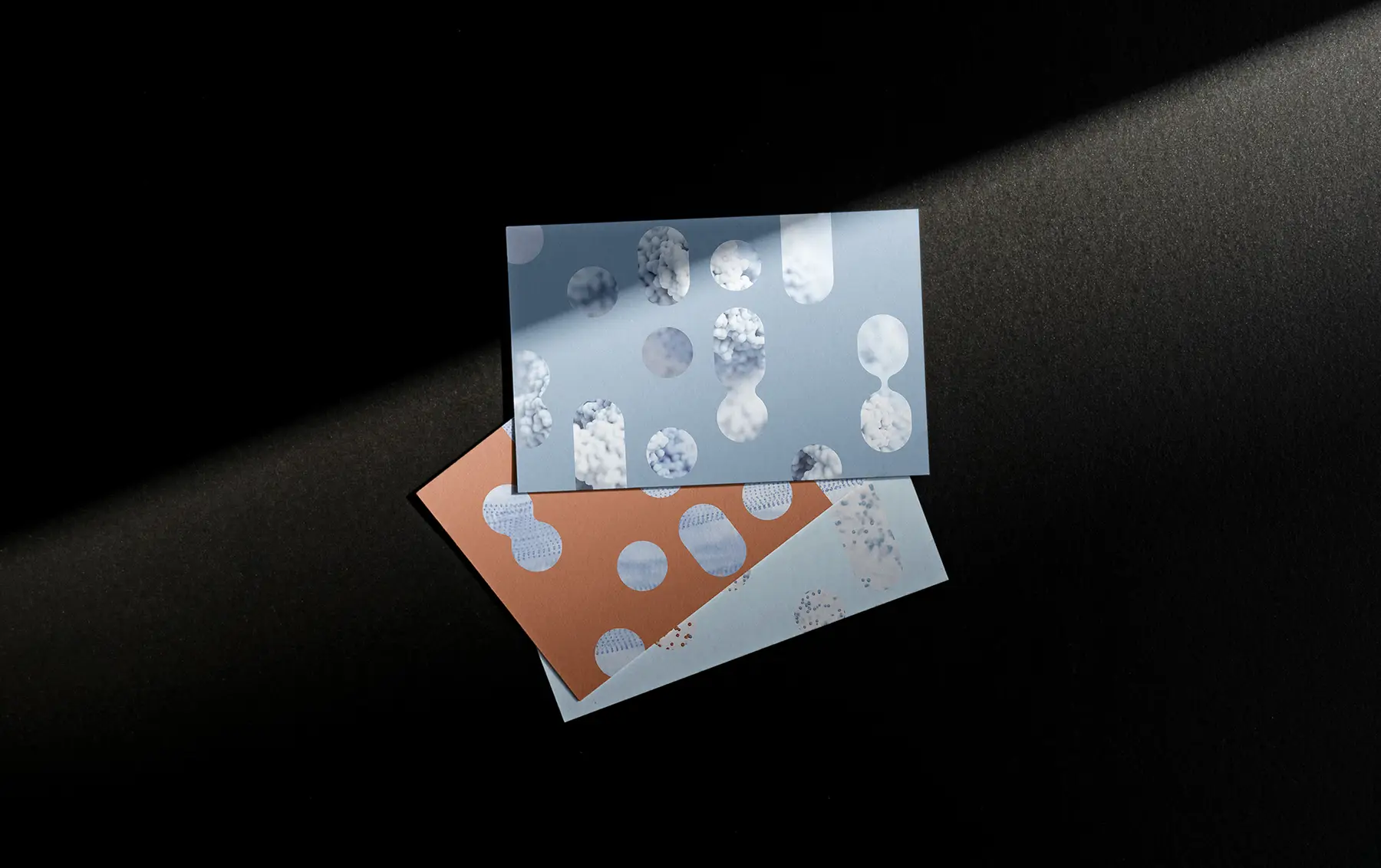
The cellular geometry of the mark doesn't stop at the logo. It extends into a flexible vocabulary of forms that operates across surfaces, scales, and contexts. Patterns, spatial compositions, and image framing devices were all derived from the same source geometry—forming a generative toolkit that lets new surfaces feel native to the identity rather than approximated from it.
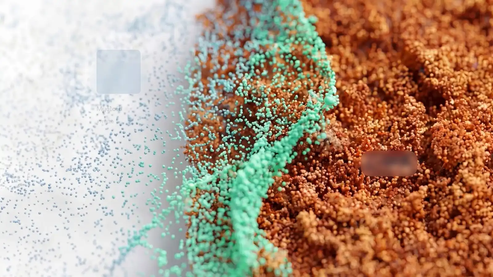
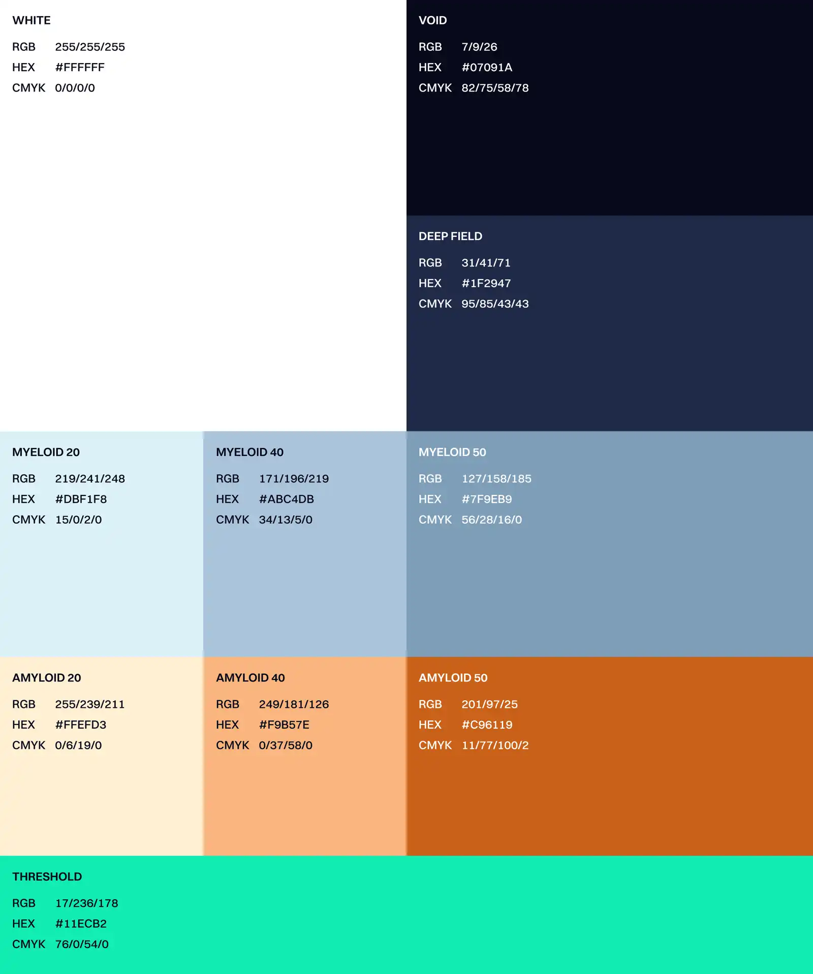
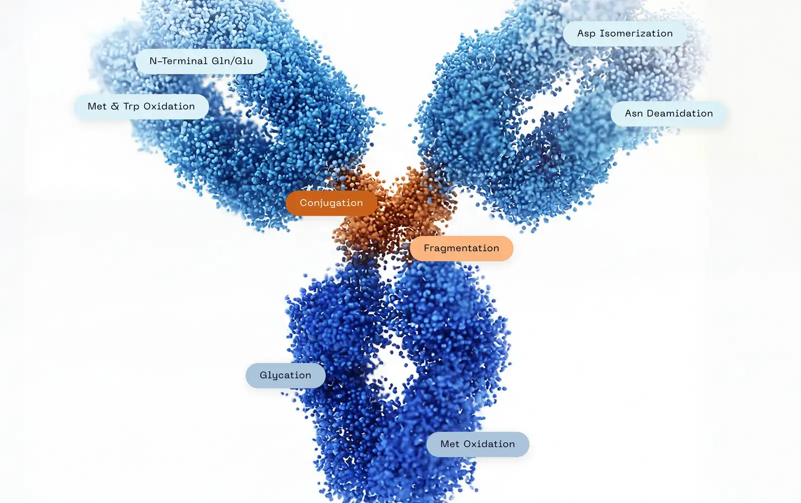
The palette takes its names directly from MindImmune's science, while the tonal logic emerged from a creative interpretation of their research imagery. Myeloid and Amyloid form the primary utility ranges. Threshold, a single high-visibility accent, marks the specific biological moment that MindImmune’s work focuses on.
"Working with Newfound gave us a visual language that finally matches the ambition of our science. Every element of this new identity was built to communicate breakthrough neuroscience and real patient impact at a glance, no explanation required."
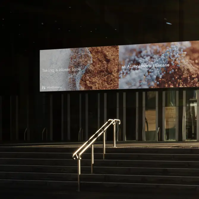

Imagery that represents the material without claiming any scientific truth.
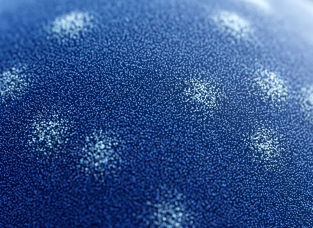
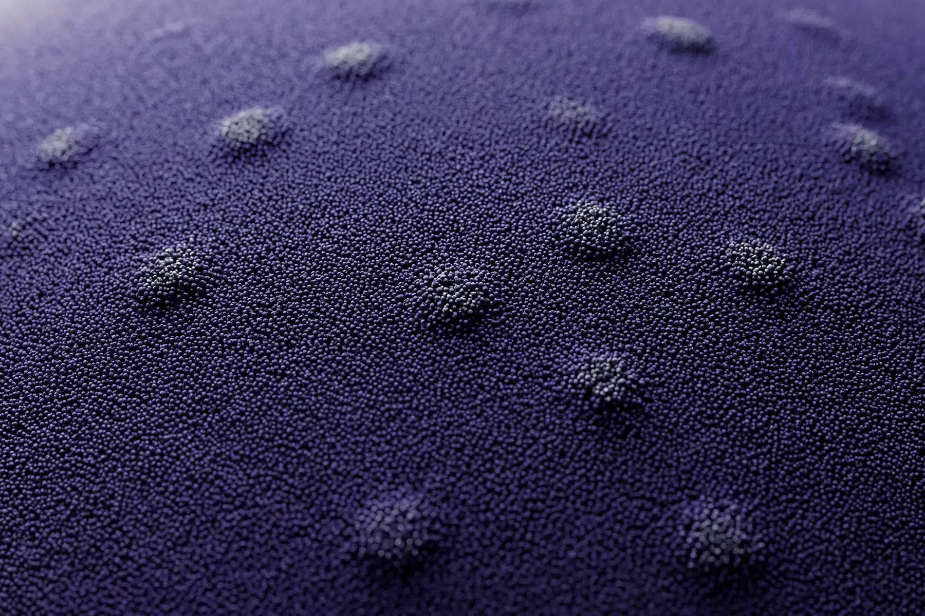
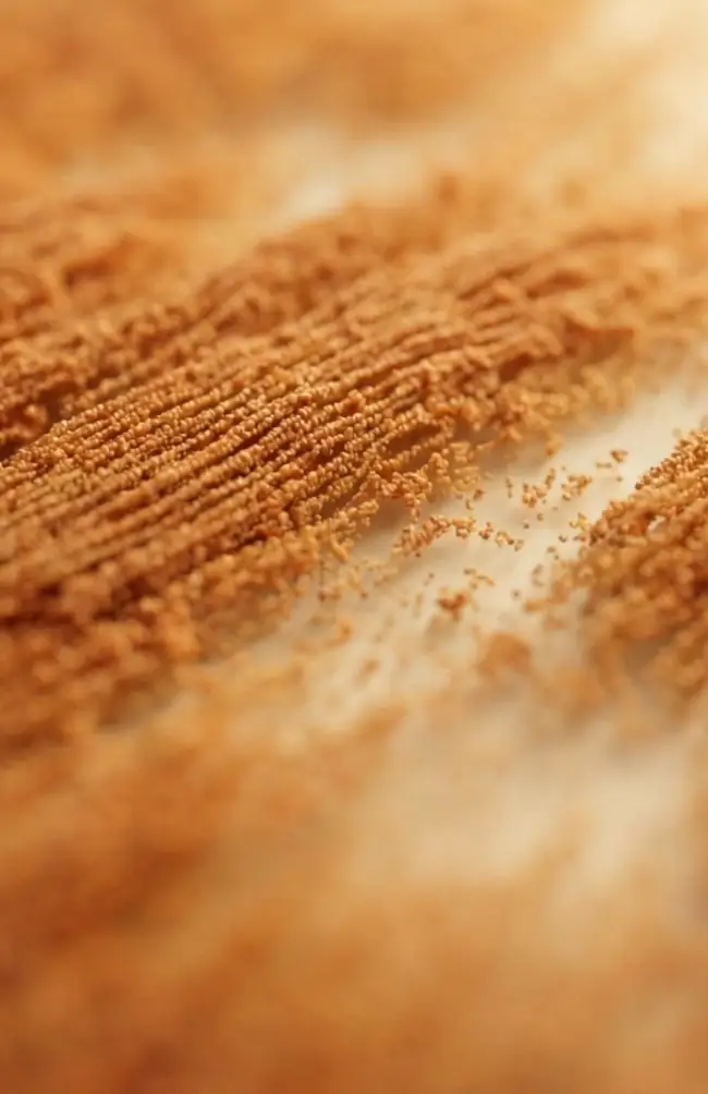
An important distinction was clear during development of the identity—the imagery shouldn’t read as real scientific data. For a company in the biotech space, it was crucial to avoid misrepresentations of the real, credible science at the heart of the work. The point cloud approach was a deliberate step to distance the brand imagery from the real science while still carrying the conceptual threads that permeate the identity.